Overview
Led the architecture and implementation of Root DS for Treez’s fast-growing B2B platform. The initiative addressed critical UI fragmentation across web and mobile, transforming significant technical debt into a unified system that reduced QA cycles by 30% and accelerated delivery.
Context
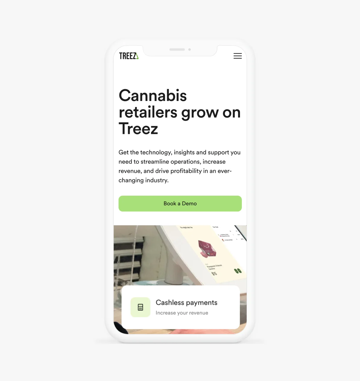
Treez serves as the mission-critical OS for enterprise cannabis retail, handling complex workflows from strict compliance to high-volume transaction processing.
However, rapid market expansion exposed the fragility of our legacy frontend. As we prepared to scale from web to a native mobile POS in 2024, the lack of a unified system became a critical blocker. We weren’t just dealing with inconsistent buttons; we were facing a fragmented codebase that made every new feature exponentially more expensive to build.
At that time, the operational reality was brittle:
- Siloed Workstreams: Design and Engineering lacked a shared vocabulary, leading to divergent solutions for identical problems.
- Decentralized Assets: No single source of truth existed; Figma libraries were detached from production code.
- Compliance Blindspots: Accessibility was treated as an afterthought, creating significant debt for future enterprise requirements.
- High-Friction Delivery: Without standardized tokens, developers spent valuable cycles manually interpreting design specs.
In short: We were paying a ‘re-invention tax’ on every single sprint.
The Problem
Treez faced a scalability crisis. Rapid growth led to isolated workflows, where teams were constantly rebuilding existing UI, resulting in bloated codebases and inconsistent user experiences across the B2B SaaS platform.
“Without a system, we were rebuilding the same UI — with different quality — every sprint.”
Fragmentation was eroding user trust and confusing navigation patterns.
Zero 'source of truth' led to massive file duplication and version conflicts.
Design and Engineering spoke different languages, causing implementation errors.
The product was legally exposed and unusable for assistive tech users.
Misaligned styles trapped the team in endless pixel-pushing cycles.
Without documentation, onboarding relied on verbal transfer, costing weeks.
The design team knew we needed a solution that was more than just a component library — we needed a system.
Why Root DS?
We named the system Root because it represents the foundation beneath everything we build — a connected structure of tokens, components, and design decisions that supports the entire product experience.
Like a root network, it’s invisible to users, but essential to what they see, feel, and use.
Objectives
Our goals were clear and intentionally limited to the web platform, with the understanding that mobile support (POS) would come next:
- Establish visual and interaction consistency across all web surfaces
- Improve accessibility by default through compliant, tested components
- Reduce redundancy in Figma and production code
- Enable faster onboarding and lower the cost of delivery
- Create a system flexible enough to support future POS and mobile products
Discovery
Our process began with a comprehensive discovery and audit phase:
Visual Debt Overload
Uncovered years of accumulated drift, including 20+ undocumented grey styles and fragmented navigation patterns.
Redundancy Scale
Cataloged 100+ detached patterns, revealing that ~60% of frontend effort was spent rebuilding existing UI elements.
The Handoff Gap
Identified a lack of 'source of truth' for Engineering, causing constant guesswork and recurring UI regressions.
Compliance Risk
Flagged critical risks: 80% of core interactions failed WCAG 2.1 AA standards, threatening enterprise contract requirements.
Velocity Bottleneck
Pinpointed the drag: Manual translation of design styles to CSS was adding 2-3 days of overhead to every sprint.
We didn’t assume what teams needed — we investigated and listened.
Design Principles
We defined 5 guiding principles to shape every component, token, and interaction:
Consistency over customization
Accessibility by default
Platform-aware, not platform-bound
Tokens over styles
Documentation is part of the product
These principles ensured Root wasn’t just scalable — it was sustainable.
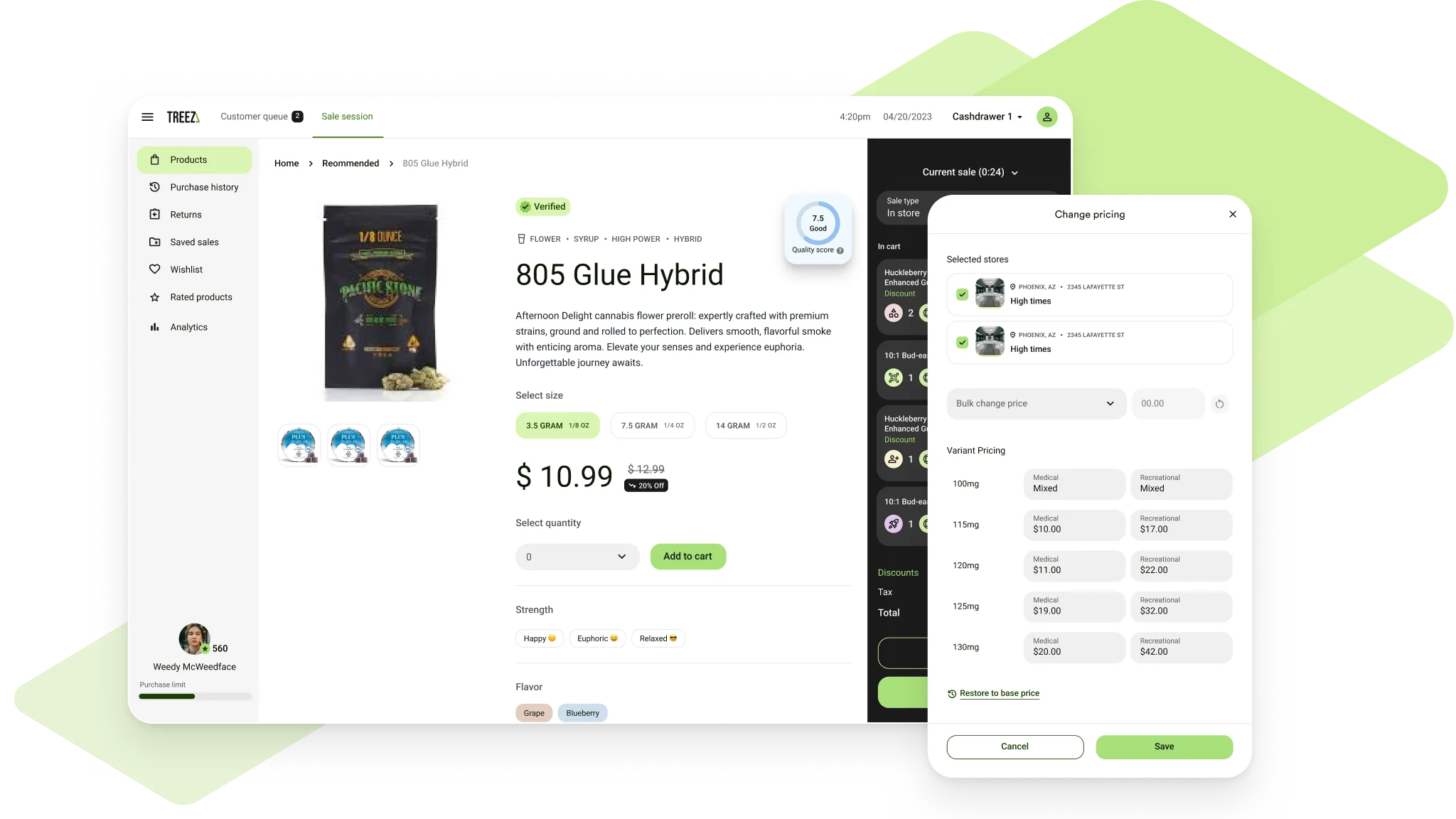
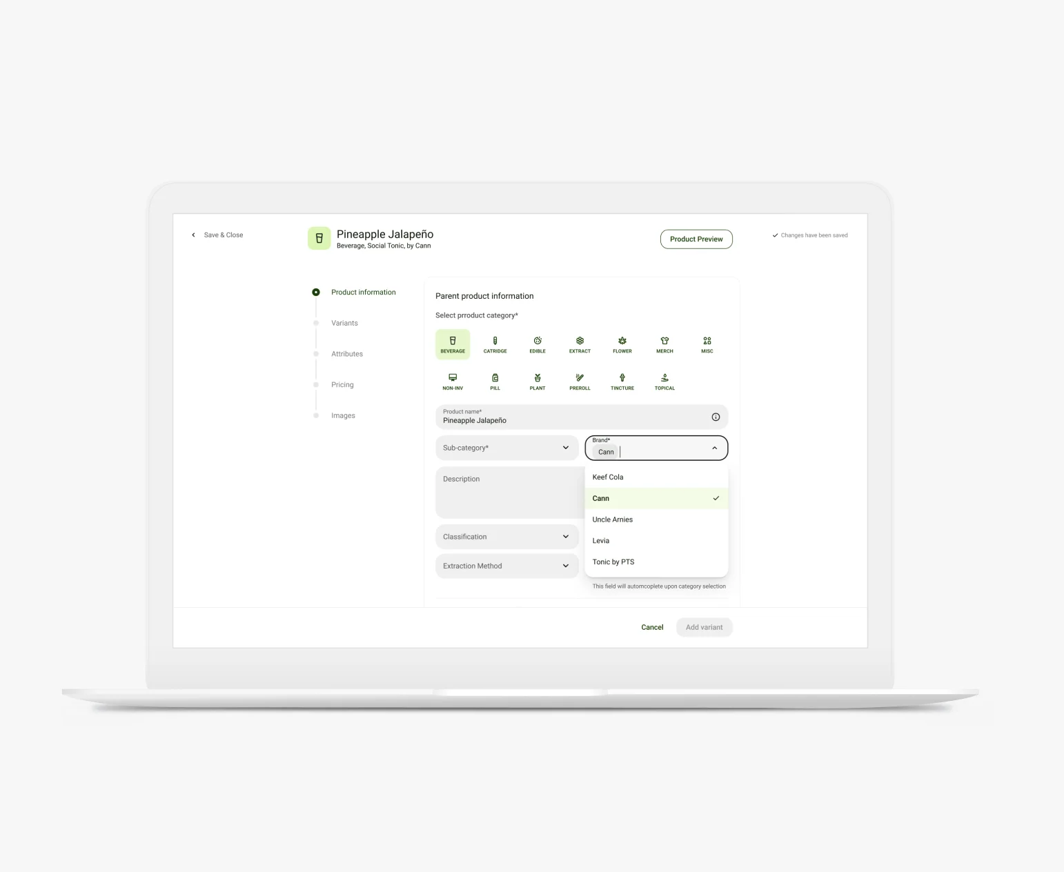
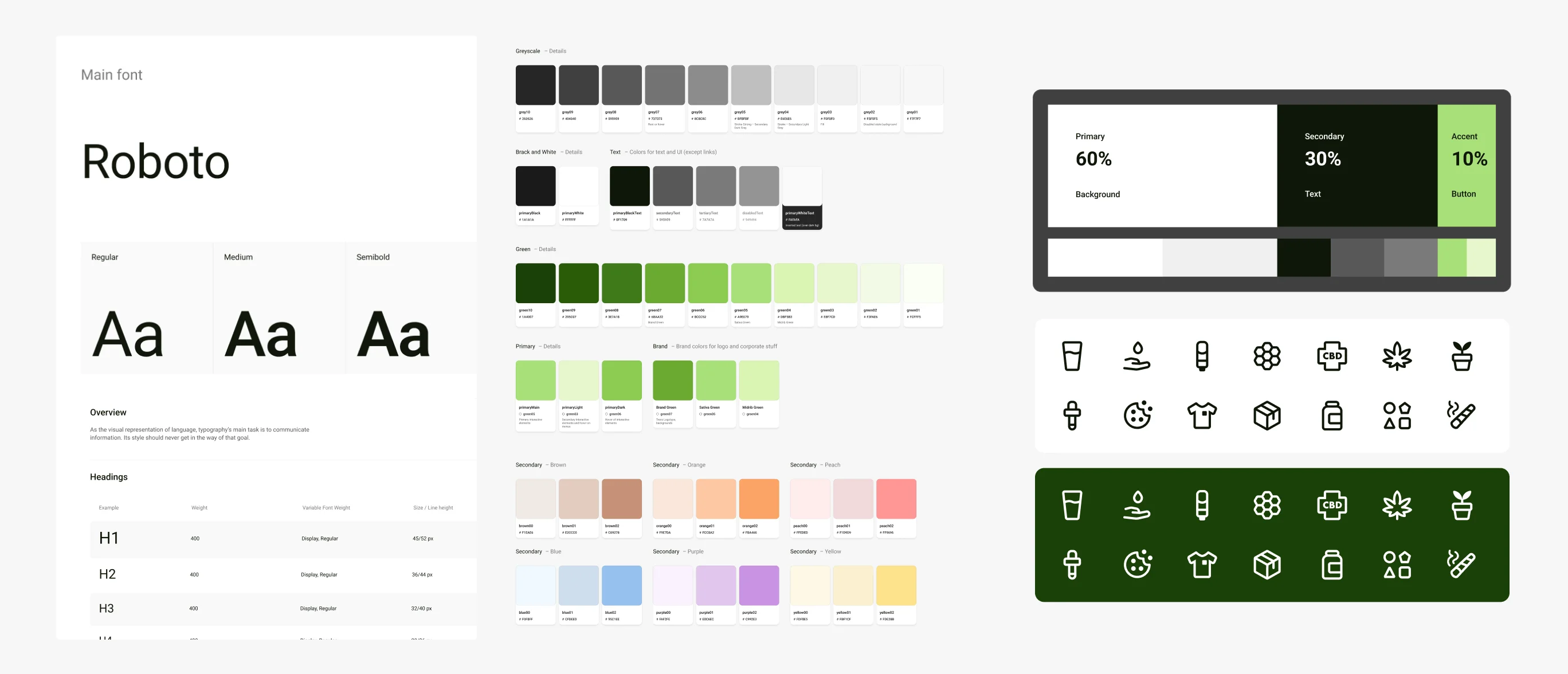
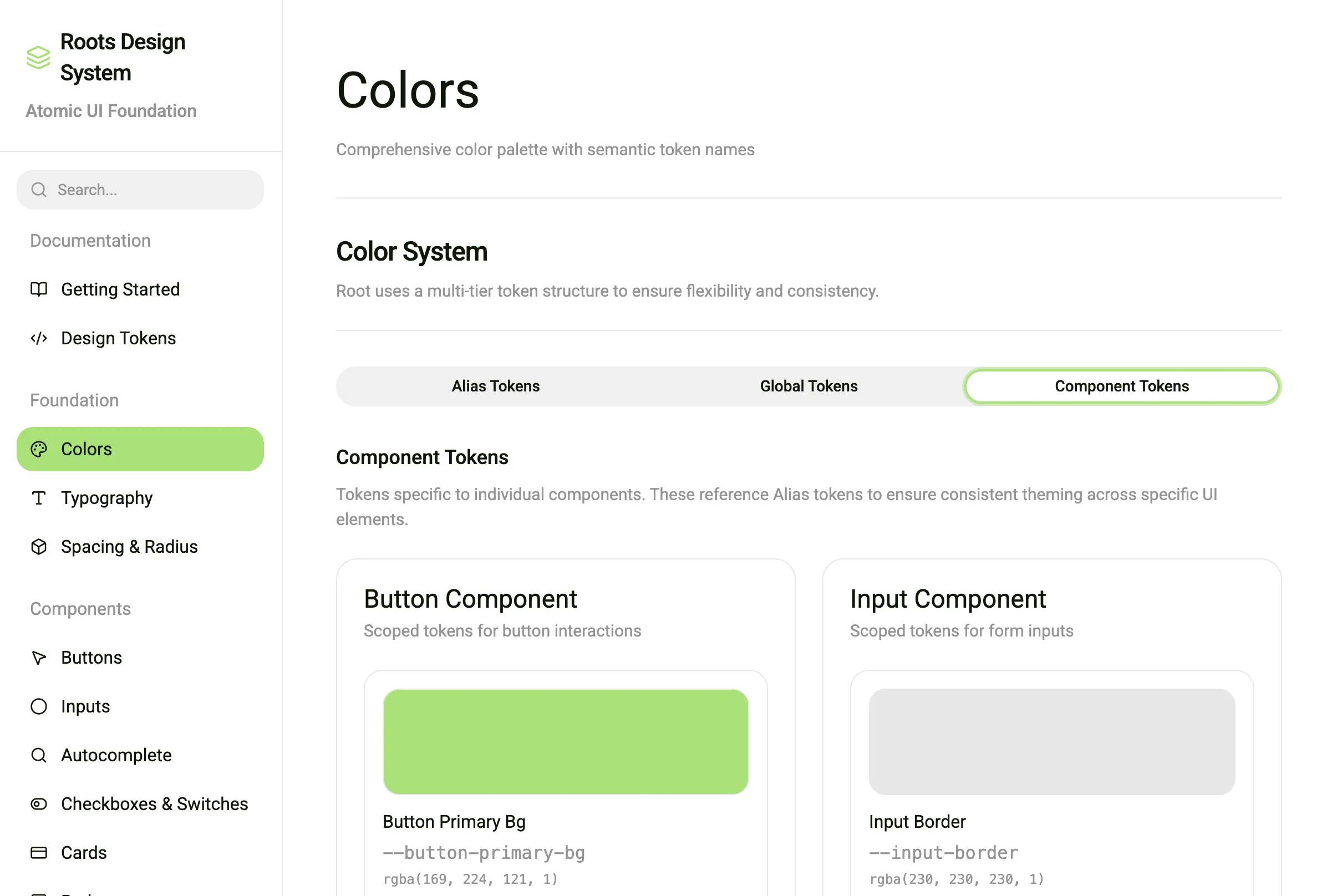
System Architecture
Root was built on a strict atomic foundation using a multi-tier token structure (global vs. alias vs. component tokens). This ensured theming flexibility for future white-labeling and paved the way for mobile parity.
Foundations
- Color palette and contrast-compliant tokens
- Typographic scale and modular spacing system
- Iconography, grid, and motion primitives
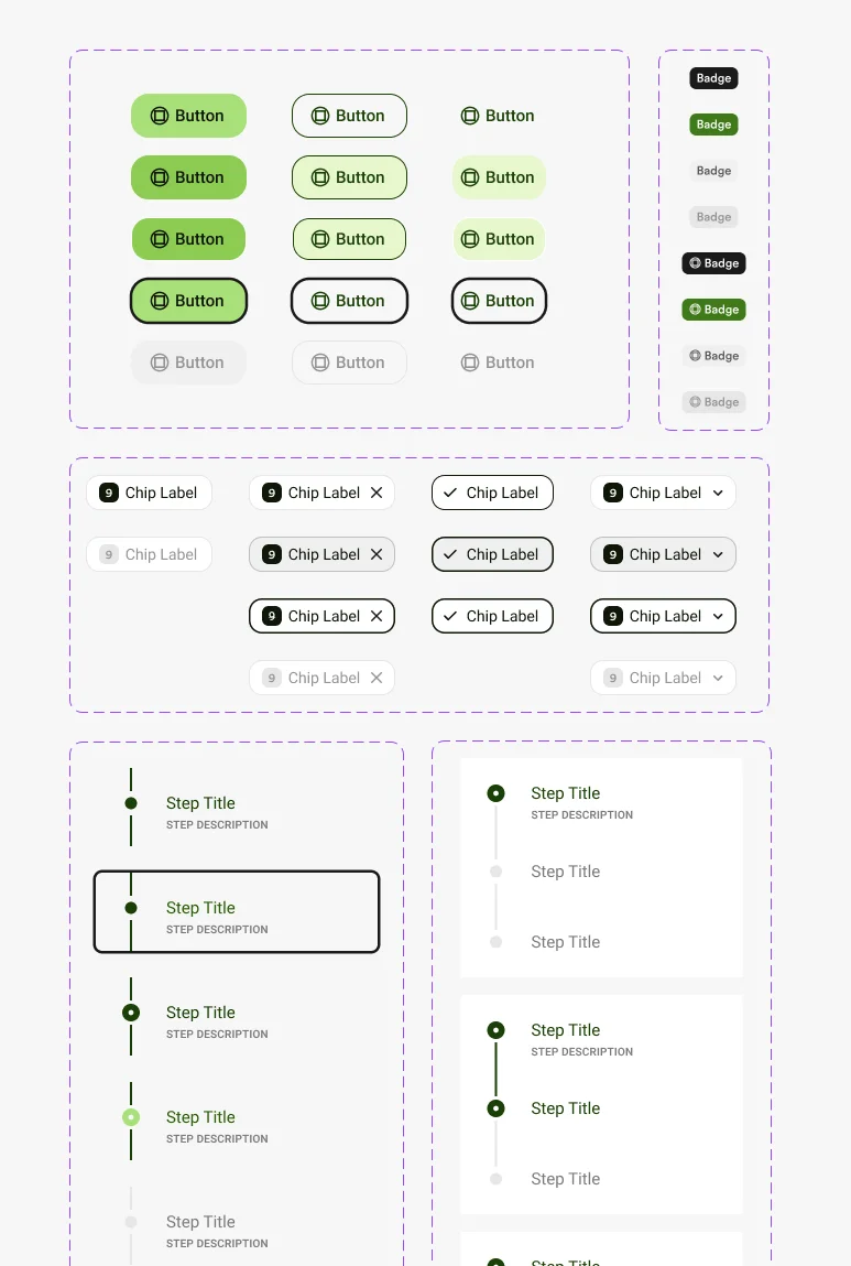
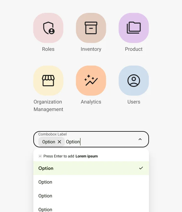
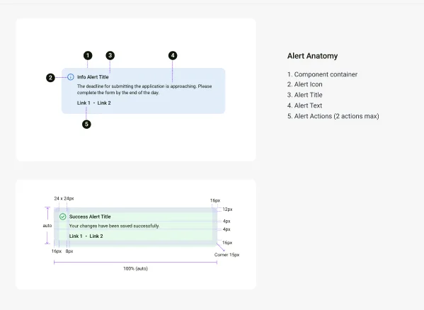
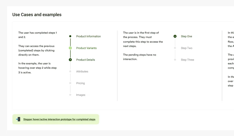
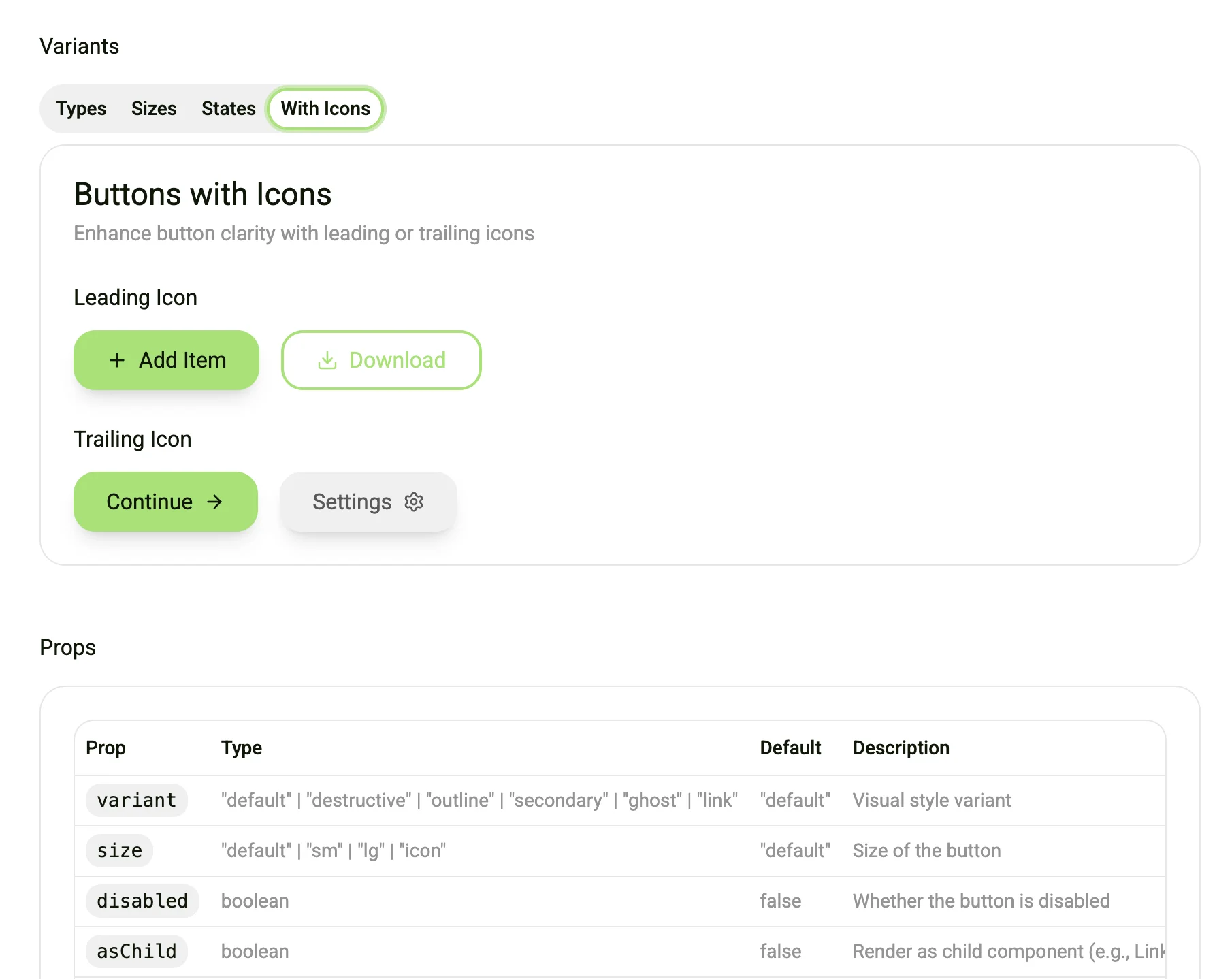
Components
- Buttons, form elements, tables, cards, navigation
- Responsive structure for admin-heavy dashboard layouts
- Component states: hover, focus, disabled, error
Patterns
- Form groups, input validation, error handling
- Empty states, alerts, filtering, modals
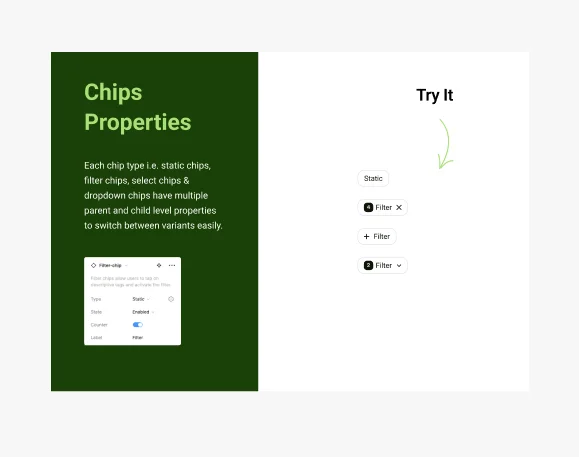
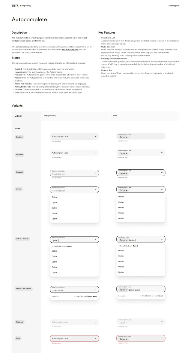
Documentation
- Figma library with tokens and auto-layout
- Zeroheight for usage guidelines, do/don’t examples
- Connected to Storybook for developer parity
Collaboration & Rollout
“Designed with engineering — not for them.” We replaced brittle handoffs with a Shared Ownership Model, ensuring technical feasibility from day one.
- The Bridge (Portal): Co-developed a custom internal reference portal mapping Figma tokens directly to CSS variables, ensuring 1:1 implementation parity.
- The Governance: Established a bi-directional contribution model, allowing both designers and developers to evolve the system responsibly.
- The Culture: Led onboarding workshops to shift the team mindset from “guessing styles” to utilizing the system as the single source of truth.
Outcomes
Root created clarity and scale across the Treez design and development ecosystem.
“It’s the first time we’ve had a true source of truth” — Sam, Engineering Lead
What’s Next
Root was intentionally scoped to the web platform, but its architecture was designed to extend into mobile and POS — a roadmap priority for 2024.
In progress:
- Extending tokens for mobile breakpoints and interaction patterns
- POS app alignment with web design language
- Brand theme flexibility for white-label features
Future goals:
- Pilot automated accessibility linting in CI/CD pipeline
- Versioned documentation with automated changelogs
- Design ops dashboard for system health and adoption metrics
Reflection
Root wasn’t just a project — it was a shift in how Treez teams build, collaborate, and scale.
We moved from individual craftsmanship to shared ownership. From design chaos to clarity. From reactivity to intentionality.
And we did it by listening, aligning, and scaling with purpose.